03 Bookish
Streamlining the search and product discovery experience to build user trust and convert browsers into buyers.
UX/UI
Redesign
Website

The brief
Bookish is a spanish online bookstore that started in 2017 as a curated subscription, and today combines e-commerce, subscriptions, three physical bookstores, and a Young Adult literary festival, Crush Fest.
Its differentiator has always been the same: human curation over sheer catalogue size.
We started with a shared foundation: identical book data, but distinct bookstore brands. The data isn't written by Bookish—it comes directly from DILVE, Spain’s official database, using the industry-standard ONIX format.
The problem
How do we create a trustworthy book page that adapts seamlessly to every book in the catalogue, from the best-documented to the barely-documented?
The key insights
How readers chose a book
1
Theme and subject
mentioned by 83% of the readers
2
Author Reputation
mentioned by 52% of the readers
3
Personal Recommendations
mentioned by 41% of the readers
FGEE 2025, national data
The importance of recommendations
62%
of readers say they look for information or recommendations before choosing new reads by 83% of the readers
La Federación de Gremios de Editores in 2025
Bookstores and human recommendations were also highlighted during our research interviews with the following quotes
Written note from the bookseller
“The little handwritten card inside where the bookseller left a note... it'll really make me want to read it.”
Human recommendation from the bookseller
“I like having human contact in bookstores, a real person suggesting a read they personally enjoyed.”
Endcap that catches the attention
“I buy books displayed on the endcap (bestsellers usually) and the visual just catches my attention”
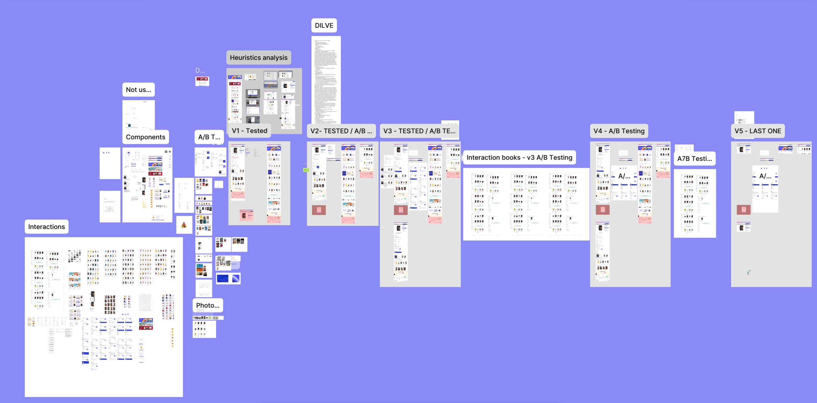
Ideation & Testing process
Using the MoSCoW matrix to prioritize the features to include in the redesign

People also read recommendation
Mark as read option
Leave a review

All the reviews visible at first sight
Time reading
15
testers in total
5
participants per testing phases
5
testing rounds with 1 concept testing and 4 usability testings
1
Homepage & book page: information hierarchy
2
Book page hero section: A/B testing
3
Book page datasheet information from DILVE
4
All results page: Card sorting and A/B testings
5
Book page author and reviews sections: A/B testings
The design
1 The homepage
We focused our attention on the information hierarchy
We restructured the homepage based on direct user feedback and stakeholder insights.
We brought bestsellers to the very top after concept testing showed users wanted instant access to popular titles.
Immediately below, we prioritized "Palabra de librera", reinforcing Bookish’s signature human curation. Finally, we moved up the Agenda section above publishers list, responding to clear user preferences for event updates over publishers.
2 The search bar
We conducted a heuristic analysis on the search bar.
BEFORE
The results, especially for the authors, are not clearly distinct. The search bar isn’t responsive and the "search all" button can't be found, you have to scroll down. Also, our testers struggled to distinguish between the different book editions as there were multiple one.
NOW
Let's say you are looking for the book "Animal salvaje" from Joel Dicker, it fits the screen and we added explicit format labels in the book cards, and a light color background to show results selection with mouse overlay

3 All results page
We focused on the filters information hierarchy and the fact that animal salvaje is a book in multiple languages.
FILTERS
Card sorting helped define natural category groupings
A/B testing proved users preferred filters collapsed by default to prioritize scanning the book grid.
So we came up with Price first, Language second and Category third.
LANGUAGES
Testers wanted to select their language early on to avoid mistake, we added a dedicated space to the product card.
5 testers confirmed that a text format provided the clearest user experience.
4 The book page
We conducted a heuristic analysis and here are our findings.
HERO SECTION
The author and the translators are not differenciated clearly. As for click and collect we can't see in which library the book is available. In addition, the majority of users wanted a version where you could chose the book format inside the product page.
BOOK DETAILS
You can see lots of information so we wanted to ensure that people could understand clearly what the book is about, streamline redundant information like the critics in the sinopsis and make the "read more" buttons more visible.
We refined the spec sheet after user testing. We dropped duplicate info from the header (such as autors and ISBM), turned technical jargon into plain, simple spanish and we added 'Original Language' based on direct user feedback.
REVIEWS
Reviews are displayed in an unfiltered, scrollable list, making them difficult to navigate in case of many reviews.
AUTHOR SECTION
In the original design, the author's information sit at the same visual level as the purchase block. It is competing directly for the user's attention, also we can't see directly the book from the autor selection which is below.
Key learnings
Trust beats volume
presenting the right info at the right moment builds confidence far better than overloading the page.
The data was already there
We didn't need more content. We just needed better design to unlock its value.
Designing for the hardest case made the easy better
Designing for the most complex cases ultimately made the experience better for everyone.
Next steps
Validate at scale
While user testing provided valuable insights, scaling the tests across the full audience is essential to validate our findings at scale.
Scale across the other brands
Test and apply the template to all four store brand identities.
Extend the review community
The review volume needs to grow to fully activate trust on the new functionality we designed.
